
Competitor comparison pages are often one of the highest-converting pages you can have on your website.
For most companies I work with, they almost always have a comparison page sitting in the top 10 for top conversions.
It’s an extremely powerful page that you want to have.
In this article, I’ll walk through how you can set up a competitor comparison page and a couple of examples you can take inspiration from.
Let’s jump in.
Rather watch a video? I’ve got you covered.
How Does a Competitor Comparison Landing Page Work
A competitor comparison page shows your product side by side against your competitors.
If a user is considering your product and your competitor’s product, this is your chance to show them why your product is the better solution.
This will range from:
- Pricing information
- Features
- Use cases
- Sometimes even public opinion
The idea behind these comparison pages is to give your audience – who’s at the point of purchase – a final reason why your product is the right choice for them.
In most cases, these pages will get traffic from organic search.
Your audience has already boiled their options down to two companies and wants to see what solution has the better value.
This is your opportunity to show them your product is the right choice.
Mistakes to Avoid When Creating Competitor Comparison Pages
When you’re building out competitor comparison pages, you want to get these right.
These pages should be as perfect as your pricing page.
It is likely the last thing a user will see before they make their final decision.
So to make these comparison pages worth it, I’ve listed off a few mistakes I see companies make when they’re building out these pages.
Not Giving an Honest Review of Your Product
The absolute worst thing you can do is be dishonest in your comparison.
A comparison page isn’t your chance to sling mud at the competition.
The last thing you want is for your audience to think you’re giving a biased review.
I mean you are, but you don’t want to make it extremely obvious.
That will immediately turn them off from your page and maybe even your product.
So try to be as helpful to the user as you can.
Lack of Media
While there are worse things you can do for a competitor comparison page, a lack of images is a surefire way to make your readers disengaged with what you have to say.
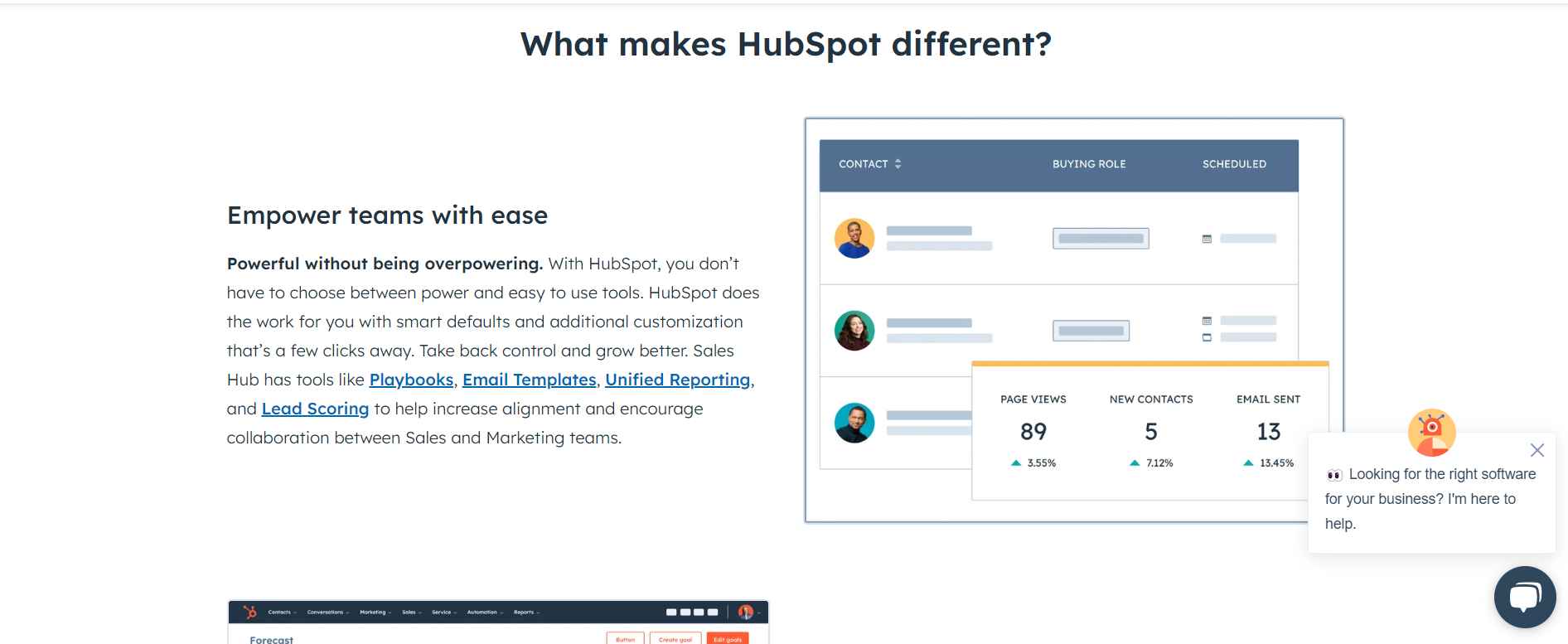
While product-led images are recommended, I’d also highly encourage you to set up a graph of some sort, too.
You don’t want a giant white paper explaining each difference.
Create a graph that easily shows how your product matches up against the competition.
You can probably include the majority of your information inside this graph.
Lack of Internal Links
Another mistake I see companies making with their comparison pages is burying them on their website.
The goal of these pages is to have them found.
If you don’t add internal links for them, people likely aren’t even going to know they’re there.
Sure you can get traffic from SEO from them.
But internal links will help users on your website easily navigate to those pages.
Not to mention that internal links will probably help your page perform better too.
Being Afraid to Mention Your Competitors
This is the cardinal sin of competitor comparison pages.
If you aren’t willing to mention your competitors, these pages probably won’t even be created.
For some reason, companies are highly against listing off their competitors.
Especially when their competition does something better than them.
Remember, at the end of the day, this content is supposed to be helpful to your audience, not your competition.
Your audience is ready to convert, so if they’re looking for a comparison page and you don’t have one (but your competitor does), chances are they’ll do more research into that company.
If your competition has a comparison page against you, but not vice versa, you’re basically letting your competitor control the narrative around your product.
So it will be a very easy way for them to steal customers away from you.
How to Create a Competitor Comparison Landing Page
Now that we’ve covered what to avoid, let’s talk about what you should focus on.
I’ll list off the following ways to make a solid competitor comparison page.
Know Your Company’s Limitations
As I mentioned before, you want this to be an honest review of your product.
Don’t be afraid to highlight areas where your competition succeeds.
The goal of this page is to give an honest review of your product to users who are considering it.
The last thing you want is for them to leave thinking you’re untrustworthy.
We want to build trust with our audience.
And the best way we can do this is by being honest.
Have a CTA Right at the Top
These pages always have solid conversion intent.
If you want users to take the next step, make sure your CTAs are easily accessible.
Sure we’ll have a CTA in the header, but have something right in the body that they can click on when they’re ready.
That doesn’t mean more CTAs are better, just have them so they’re easily accessible.
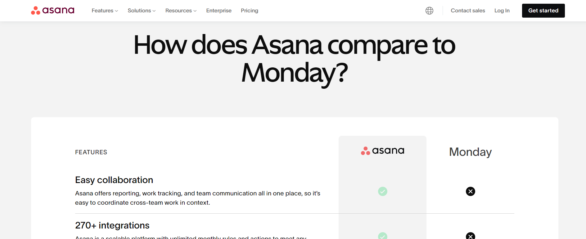
Include a Competitor Comparison Table
As mentioned before, have a table that highlights how your product matches up against your competitor.
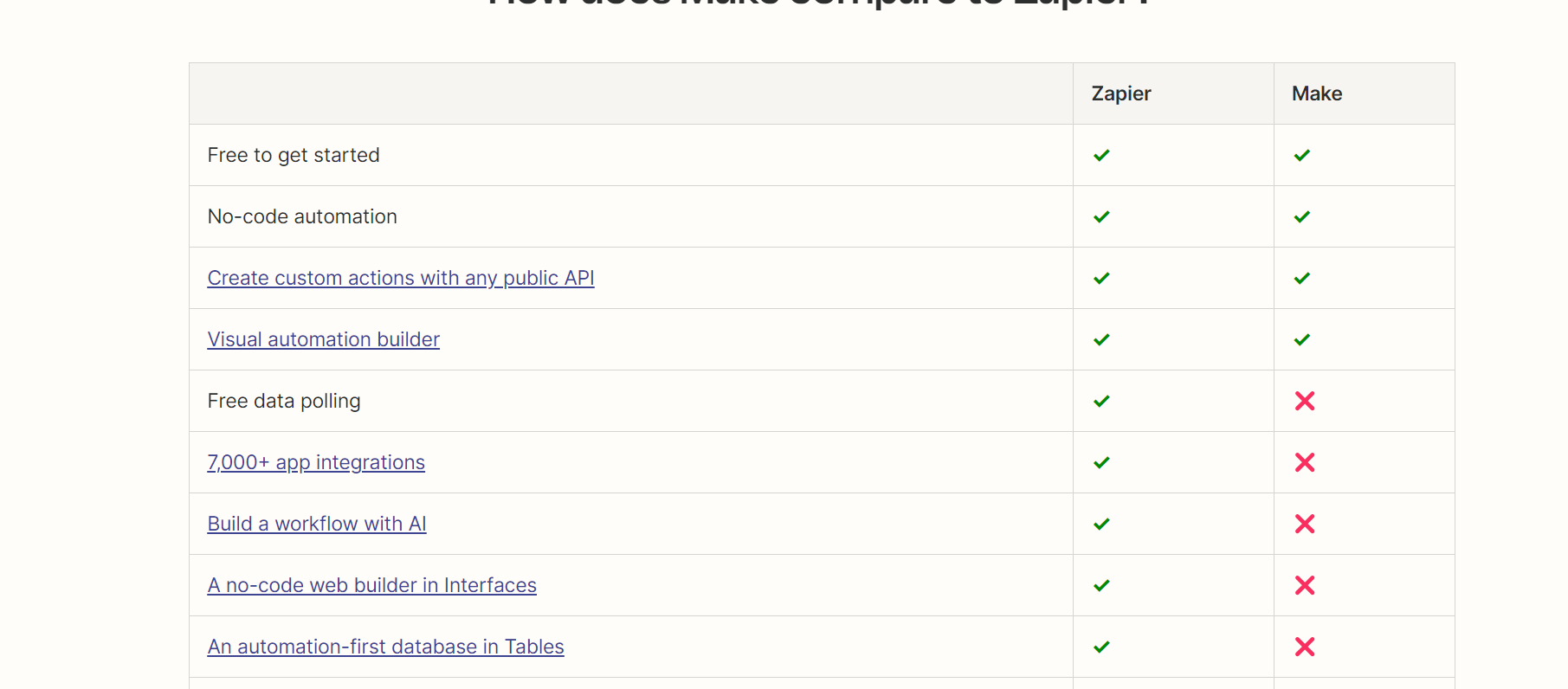
Your readers will spend the majority of their time on these pages looking at the table, so make sure you cover it in full detail.
Include Data If You Can
One of my personal favorites is when competitor comparison pages include survey data on those products,
I’ve seen it a few times before and I think it’s a genius idea.
It’s the ultimate social proof for your audience.
Sure you’re telling them how your company believes it matches up against the competition, but how does your audience feel about both products?
People are much more likely to trust a third-party over a first-party reviewing themselves.
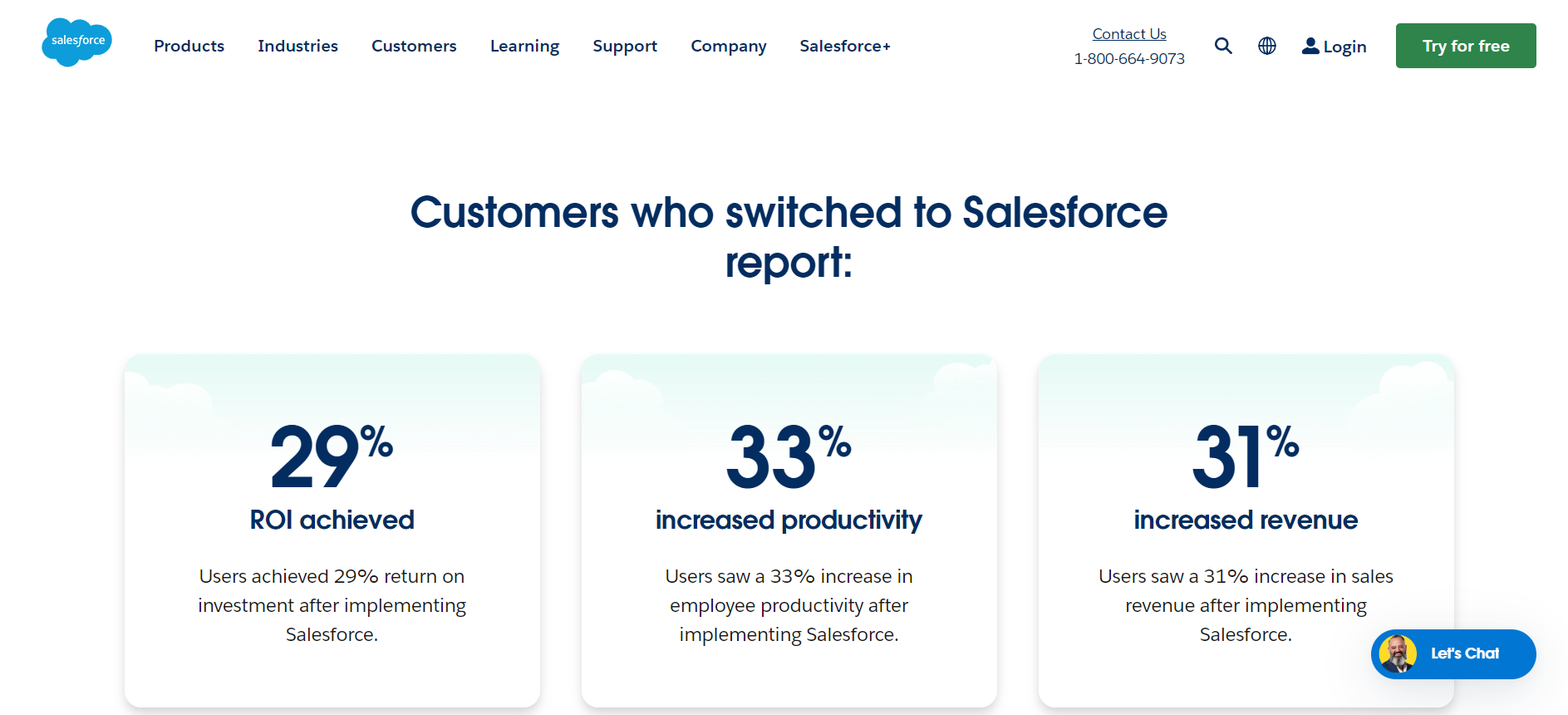
Include Social Proof
Like I mentioned above, you’ll want to have more social proof spread throughout your comparison page.
You can go the data route.
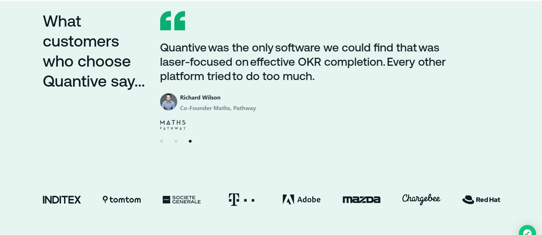
But I’d also recommend including more social proof.
This could be things like:
- Case studies
- Brands who’ve used your product
- Testimonials
Make it known that your product is being used elsewhere.
Add FAQ at the Bottom (Actual Questions Though)
You can also create FAQs for your comparison pages.
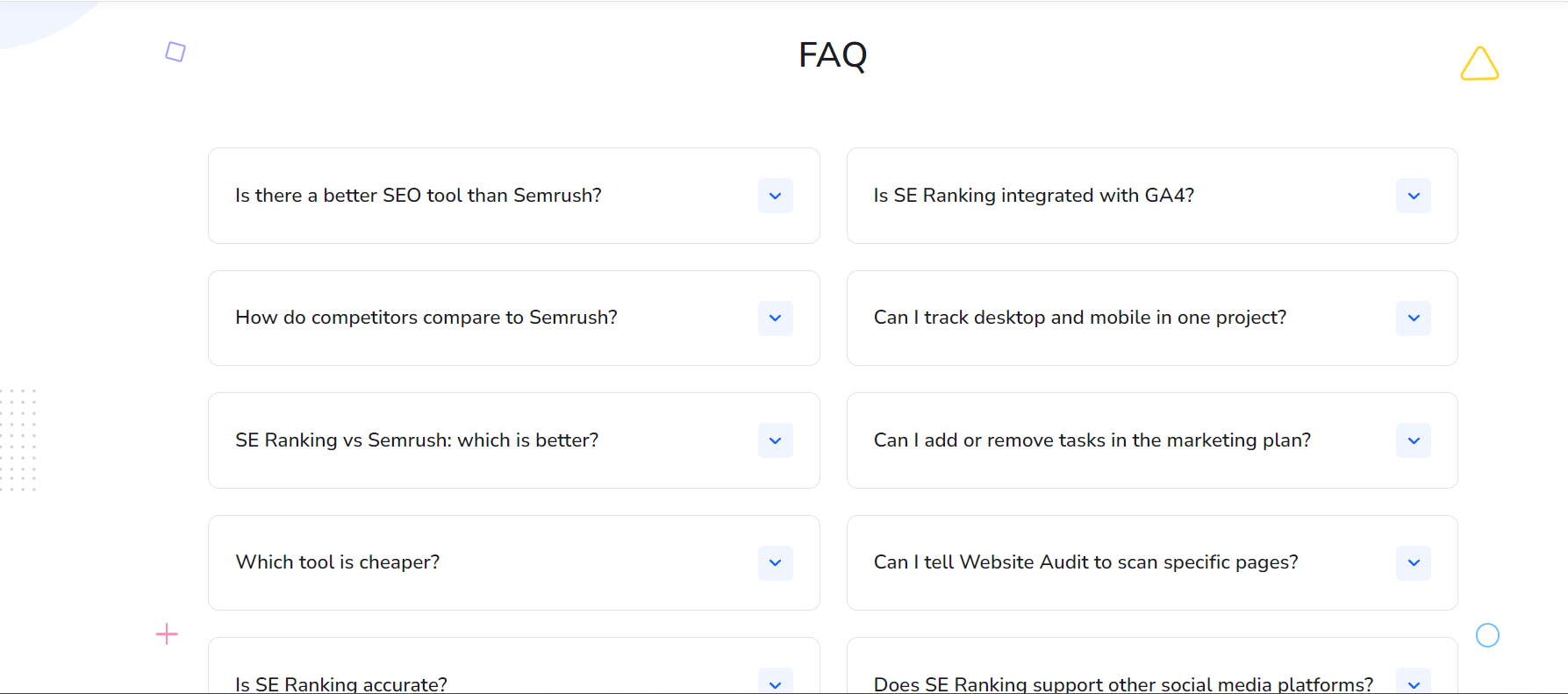
This doesn’t mean creating FAQs that you found through Google’s people also ask section.
It means finding relevant questions that can help your audience decide what the better product is.
For this, I highly recommend connecting with your client-facing teams to see if they’ve ever been asked questions about your competition or what makes your product special over the competition.
Once you have a general idea, create a section at the bottom of your page that covers those FAQs.
Create Multiple Comparison Pages
Realistically, you don’t just want to do only 1 competitor comparison page.
That doesn’t mean covering every product out there.
But it does mean creating a comparison page for the products your audience is typically considering.
Again, ask your client-facing teams who your audience is considered before they choose your product.
SEO Best Practices for B2B SaaS Comparison Pages
Okay so we covered how to build a competitor comparison page.
Let’s now talk about how to do SEO for a competitor comparison page.
Identify Your Top Competitors
You’ll want to have a solid list of your top competitors.
Ones you’ll want to cover with a comparison page.
You can use Ahrefs for this by searching for your competitors and then adding a keyword filter to your brand name.
This will show you who has comparison pages already built out for your brand.
You can also do a search for “your brand vs” which should then show you all the different sites that have covered you with a comparison page.
Once you have your competitors identified, you’ll want to plug each one into Ahrefs to see who has the most search volume.
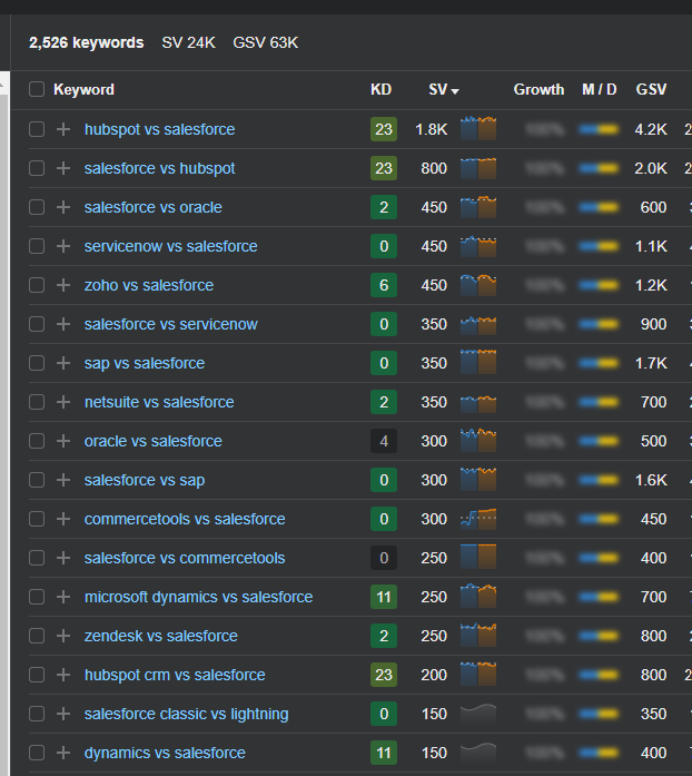
I’d also see which comparison keyword (you vs x) has the most searches too.
If you’re a more established company, you might have some luck with this.
Once you know the search volume behind each company, you can start with the ones that have the highest search volume.
Add Your Comparison Page So It’s Easy to Access From the Navigation
Like I mentioned during the internal links part, you want site users to find your comparison pages.
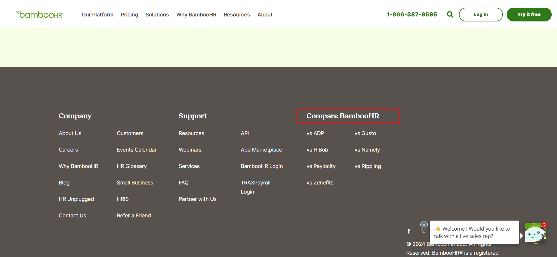
Not only does it help users actively on your site, but it will also help your pages rank better for SEO too.
Use Google Search Console to See How You Can Optimize Your Comparison Pages
While this one isn’t entirely necessary, I’d maybe look at Google Search Console to see how you can optimize these pages.
You won’t be able to see any data until after the page has been indexed, but sometimes there’s additional keywords you can optimize these pages for.
Examples of SaaS Companies Doing Competitor Comparisons Right
Let’s dive into some actual competitor comparison pages.
I’ll list off the ones that I like and what I like about them.
Ahrefs vs SEMrush vs Moz
Ahrefs is my personal favorite for competitor comparison pages.
They nail the social proof aspect that I was talking about before.
They have an entire section dedicated to what users think about their tool compared to SEMrush (their competitor).
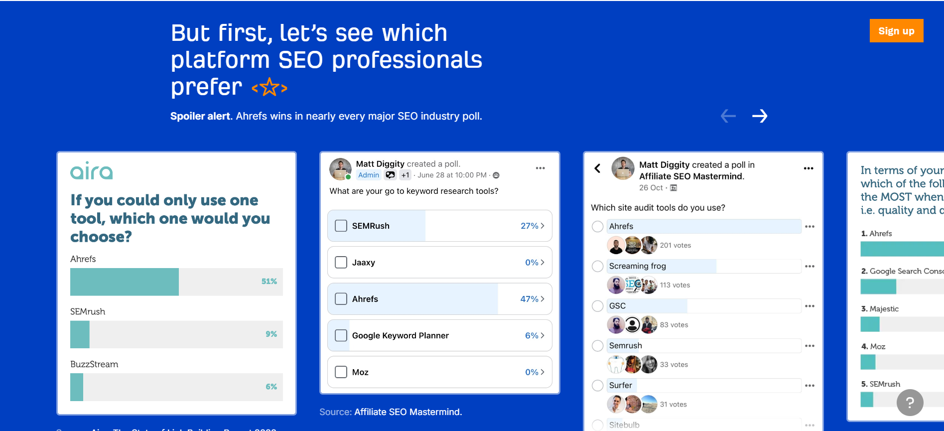
Even better, these aren’t surveys they published either.
These are third-party surveys done by industry leaders.
Like Matt Diggity, who has over 100k+ followers on YouTube.
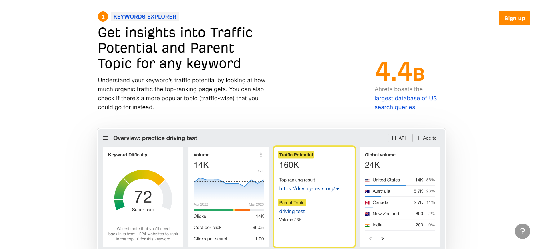
You’ll also see that they’re pointing out benefits in their comparison pages while showing product-led images.
You’ll also notice they’re killing 2 birds with 1 stone here.
So it’s not just Ahrefs vs. SEMrush and Ahrefs vs. Moz.
It’s Ahrefs vs. SEMrush vs. Moz.
So that one page ranks for 2 different intent searches.
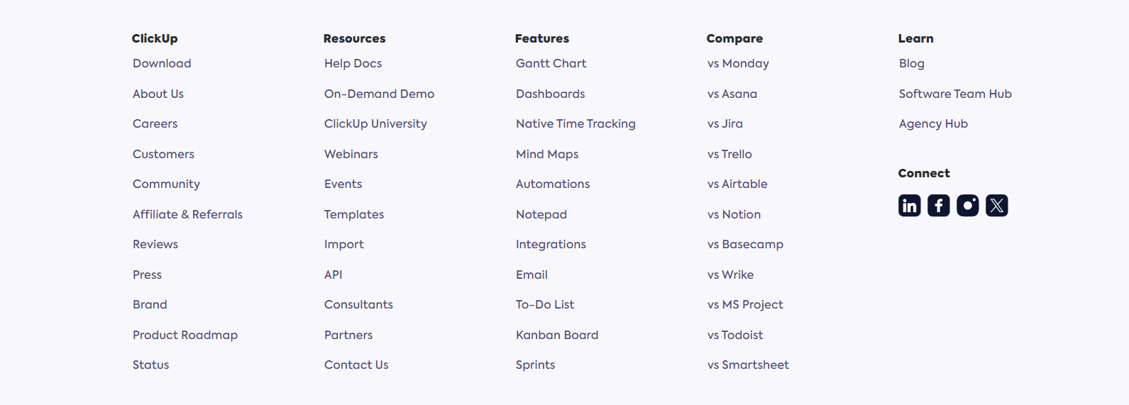
ClickUp vs Jira
I think ClickUp has a competitor comparison page for almost every competitor they have.
They’re a massive all-in-one tool so they have a bunch of competitors to pull from.
As you can see, they nail it when it comes to the comparison table.
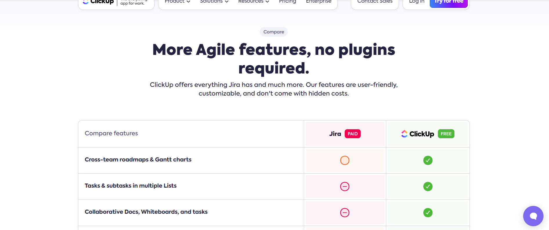
They list off every feature difference compared to their competition.
They even mention that their version of the tool is free compared to their competition.
They’ve also added social proof to their competitor comparison page too.
Start Optimizing Competitor Comparison Pages Today
I’ve seen competitor comparison pages earn the most conversions of any page type.
If you want to drive more conversions for your company, a comparison page is almost a must.
Like I said before, if your competitor has it and you don’t, they’re probably stealing away customers from you.
So you don’t want to avoid these pages.